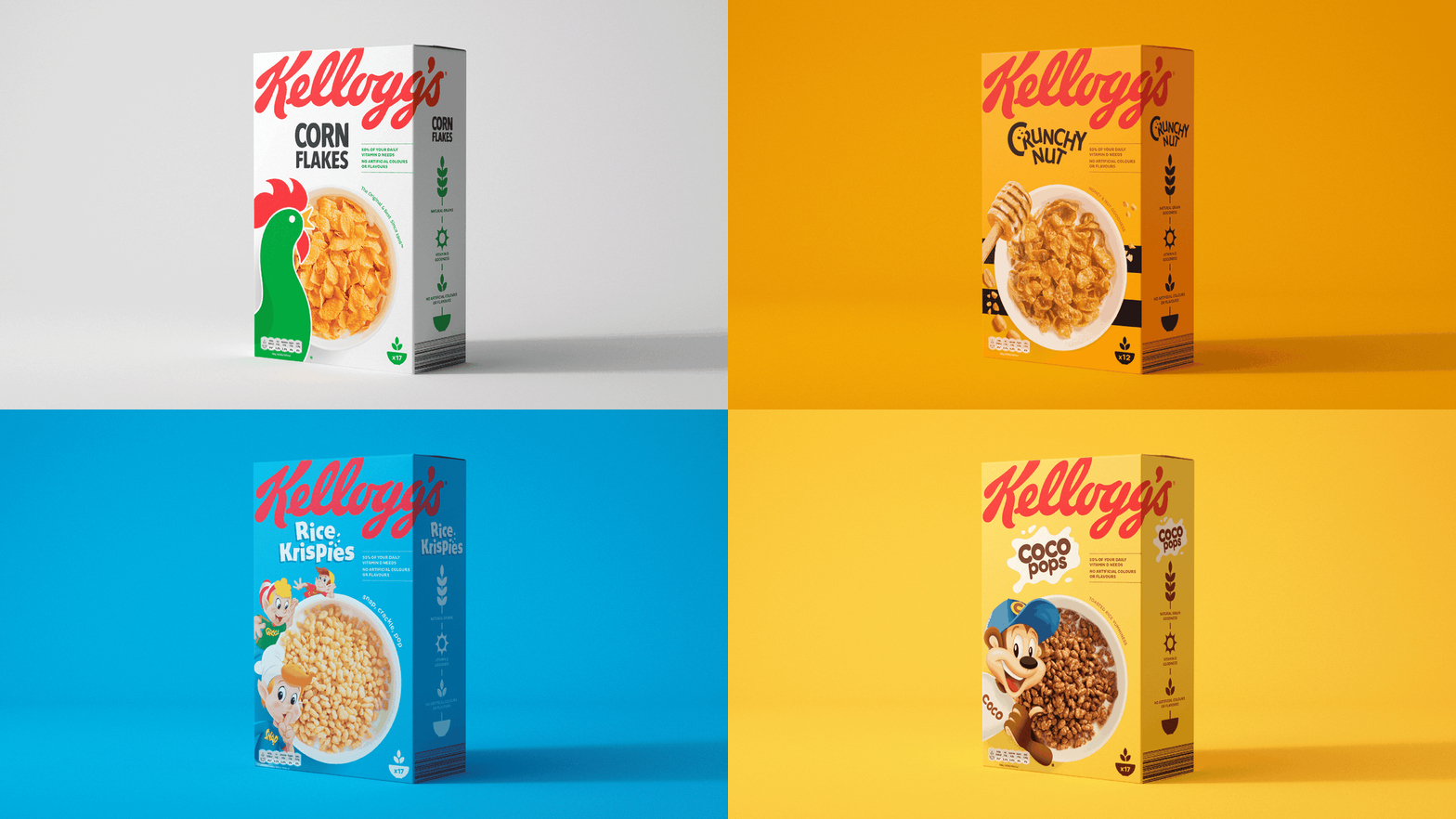
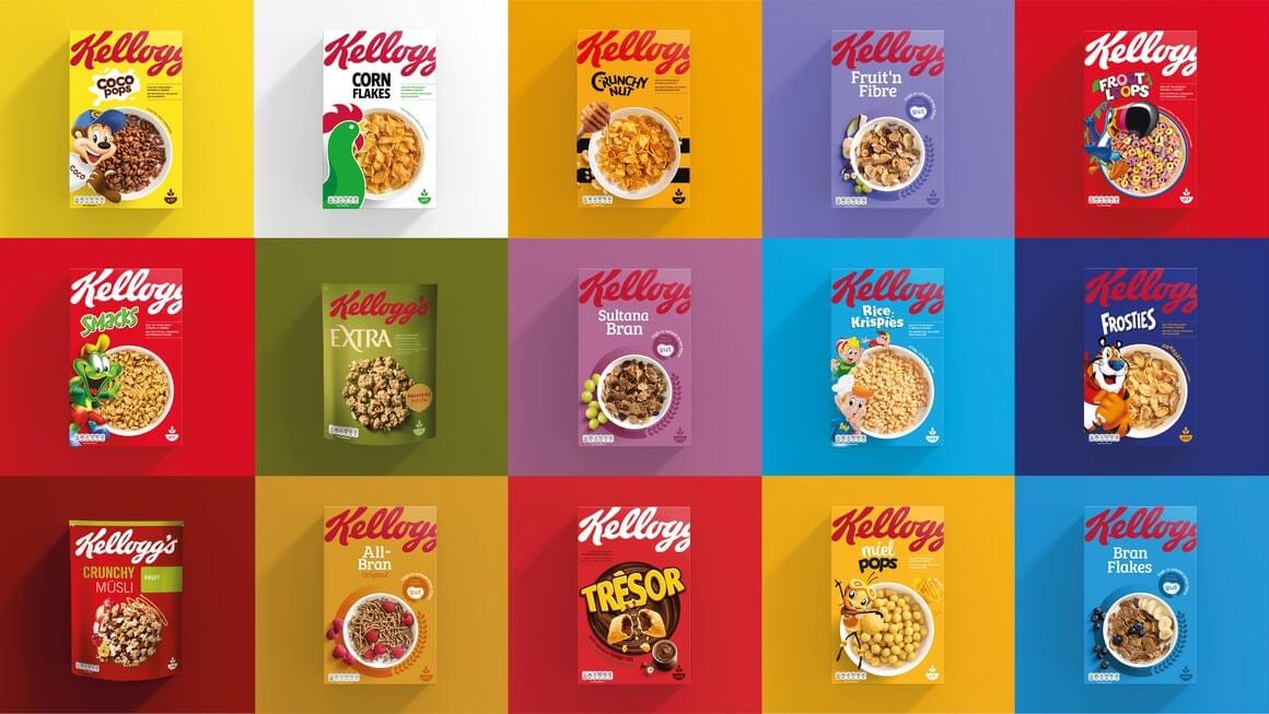
Kellogg's Aims at Transparency With New Packaging
They might be the most iconic cereal packages in the history of cereal packages, but even the most recognisable brands
understand the importance of staying fresh in the consumers mind. Kellogg’s felt it was time for a change. And maybe they were right.
The rebranding of its entire range of cereal brands for the European market makes for the company’s biggest redesign in its 113-year
history.
The new clean design uses a bowl of cereal as the focal point. The name of every cereal is in a smaller font and the iconic characters are
now bottom left.
The rebranding marketing campaign aims at making the packs instantly recognisable. It also gives the brand a “cleaner” and more honest,
transparent look that matches the modern consumer’s needs.
' transform%3D'scale(4.5)'%3E%3Cg transform%3D'translate(235 101) rotate(124) scale(38.9 99.0)'%3E%3Cellipse fill%3D'%231b84c3' fill-opacity%3D'.6' cx%3D'0' cy%3D'0' rx%3D'1' ry%3D'1' %2F%3E%3C%2Fg%3E%3Cg transform%3D'translate(65 12) rotate(302) scale(34.4 45.0)'%3E%3Cellipse fill%3D'%23fffcb4' fill-opacity%3D'.7' cx%3D'0' cy%3D'0' rx%3D'1' ry%3D'1' %2F%3E%3C%2Fg%3E%3Cpath fill%3D'%23c86d29' fill-opacity%3D'1' d%3D'M-16 93l219 4v62z' %2F%3E%3Cg transform%3D'translate(13 103) rotate(298) scale(62.3 50.3)'%3E%3Cellipse fill%3D'%23a33421' fill-opacity%3D'.9' cx%3D'0' cy%3D'0' rx%3D'1' ry%3D'1' %2F%3E%3C%2Fg%3E%3Cellipse fill%3D'%23ee9b04' fill-opacity%3D'.8' cx%3D'128' cy%3D'16' rx%3D'27' ry%3D'35' %2F%3E%3Cg transform%3D'translate(11 16) rotate(180) scale(79 64)'%3E%3Cpath fill%3D'%23ebc914' fill-opacity%3D'.7' d%3D'M-.5-.5h1v1h-1z' %2F%3E%3C%2Fg%3E%3Cg transform%3D'translate(234 20) rotate(274) scale(77.5 30.1)'%3E%3Cellipse fill%3D'%23a10025' fill-opacity%3D'.4' cx%3D'0' cy%3D'0' rx%3D'1' ry%3D'1' %2F%3E%3C%2Fg%3E%3Cg transform%3D'translate(179 37) rotate(359) scale(50 118)'%3E%3Cpath fill%3D'%23479dea' fill-opacity%3D'.5' d%3D'M-.5-.5h1v1h-1z' %2F%3E%3C%2Fg%3E%3C%2Fg%3E%3C%2Fsvg%3E)
A research study conducted by Kellogg’s found that 70 per cent of customers could locate the new packs more easily and that they
increased “purchase intent” by 50 per cent.
Kellogg's felt the old packaging was muddled and sent out mixed messaging, which meant the brand was losing its identity and purchase
intent.
The redesign also puts a focus back on natural grains, by including more information about the production of the cereal on the back of
the pack. We think the result is successful, what do you think?